Open almost any slow WordPress site in a speed test and the same thing shows up near the top of the list: images. A 4 MB phone photo used as a hero banner, a logo saved as a huge PNG, a gallery that loads forty full-size pictures before the visitor scrolls. Images are usually the heaviest part of a page, so they are also where the biggest and easiest speed gains hide.
Good wordpress image optimization is more than running a compression plugin. It means uploading the right size, picking the right format, letting the browser choose the right file for each screen, loading the main image first and the rest later and describing every image so search engines understand it. This guide covers each of those steps, shows what WordPress already handles on its own and explains how images affect LCP and CLS, the two Core Web Vitals they touch most.
Why Images Decide How Fast a Page Feels
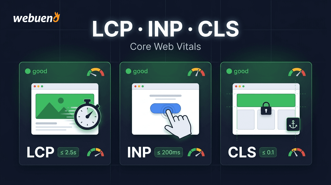
On most content pages, the largest element in the first screen is an image: a hero photo, a featured image or a product shot. That makes it the element measured by Largest Contentful Paint, the metric Google uses to judge loading speed, where 2.5 seconds or less counts as good. If that one image is heavy, late or blocked, the whole page feels slow, no matter how fast the server is.
Images also cause layout shift when the browser does not know their size in advance. Text loads, the reader starts on the first line and then a picture pops in above and pushes everything down. That movement is counted in Cumulative Layout Shift, where a score of 0.1 or less is good. If these metrics are new to you, our guide to what LCP, CLS and INP mean explains each one in more depth.
Then there is plain weight. Every extra megabyte costs mobile visitors time and data, and pages full of oversized images use more bandwidth on your hosting and CDN. The goal of image work is simple: send the smallest file that still looks sharp, in the order the visitor needs it.
What WordPress Already Does for You
WordPress handles more of this than most people realize. When you upload an image, it creates several image sizes: thumbnail (150 px), medium (300 px), medium_large (768 px) and large (1024 px), plus 1536 px and 2048 px versions added in WordPress 5.3. Themes and plugins often register extra sizes on top of these. Each size is a separate file on disk.
WordPress also protects you from giant uploads. Through the big_image_size_threshold filter, any image wider or taller than 2560 pixels gets a scaled copy, and that copy is used on the site instead of the original. Generated sizes are saved at a default quality of 82, which you can change with the wp_editor_set_quality filter.
| Feature | What WordPress Does | Since Version |
|---|---|---|
| Multiple image sizes | Creates thumbnail, medium, large and more on upload | Long-standing, 1536/2048 added in 5.3 |
| Big image scaling | Scales uploads above 2560 px | 5.3 |
| Default compression | Saves generated sizes at quality 82 | 4.5 |
| Responsive images | Adds srcset and sizes to content images | 4.4 |
| WebP uploads | Accepts WebP files | 5.8 |
| AVIF uploads | Accepts AVIF when the server supports it | 6.5 |
| Native lazy loading | Adds loading=”lazy” to images | 5.5 |
| Fetch priority | Adds fetchpriority=”high” to the likely LCP image | 6.3 |
These defaults are a good base, but they do not convert old JPEGs to modern formats, they do not shrink a 1,200 KB file that is already under 2560 px and they cannot fix a theme that loads images in the wrong way. That is where the rest of this guide comes in.
Resize and Compress Before You Upload
The single most effective habit is to resize images to roughly the largest size they will ever display before they reach WordPress. If your content column is 800 px wide, an upload around 1600 px wide covers sharp screens at 2x density. A 6000 px camera original gives no visible benefit and makes every generated size slower to create.
Resizing also keeps your server and backups lighter. Every upload produces several extra files, so one oversized photo can easily turn into ten files on disk. Multiply that by a few thousand uploads and the uploads folder becomes the biggest part of the site, which slows backups, migrations and restores.
A practical set of upload targets for most themes looks like this:
- Full-width hero images: 1920 to 2400 px wide
- Content images in a normal column: 1200 to 1600 px wide
- Featured images used in grids: follow the theme’s crop size, often 1200 px wide
- Logos and icons: use SVG where the theme allows it, otherwise a small PNG
- Team photos and avatars: 600 to 800 px is usually plenty
After size comes compression. Lossless compression removes hidden data without changing a single pixel, so savings are modest. Lossy compression throws away detail the eye barely notices, and it is where the big savings are. For photos, a quality setting around 75 to 85 usually looks identical to the original at normal viewing size.
Compress the original before upload or let a plugin do it on upload, but avoid compressing twice with lossy settings. Each lossy pass adds artifacts, and a photo that was fine after one pass can look smeared after two. Pick one place in your workflow where lossy compression happens and stick to it.
Strip EXIF data while you are at it. Camera metadata such as GPS location, camera model and editing history adds weight and can leak private details, like where a photo was taken. Most optimization plugins remove it by default, and you can check that setting once and forget it.
WebP and AVIF: Choosing the Right Format
Format choice often saves more than compression settings. WebP files are typically noticeably smaller than JPEGs at the same visual quality, and every modern browser supports them. AVIF usually compresses even further, especially for photos, but it takes longer to encode and some older image editors and server libraries do not handle it yet.
| Format | Best For | Transparency | Browser Support | Notes |
|---|---|---|---|---|
| JPEG | Photos, safe fallback | No | Universal | Larger than WebP and AVIF |
| PNG | Screenshots, sharp graphics | Yes | Universal | Heavy for photos |
| WebP | Photos and graphics on most sites | Yes | All modern browsers | Good default today |
| AVIF | Photos where every KB counts | Yes | All current major browsers | Slower to encode, check server support |
| SVG | Logos, icons, simple illustrations | Yes | Universal | Must be sanitized, can contain code |
| GIF | Rarely worth it | Limited | Universal | Use a short video instead for animation |
WordPress can accept WebP and AVIF uploads, but it will not convert your existing library on its own. Most sites handle conversion with a plugin or an image CDN that serves WebP or AVIF to browsers that accept it and keeps a JPEG fallback for the rest. Upload SVGs only through a plugin or setup that sanitizes them, because an SVG is a text file that can carry scripts.
Responsive Images With srcset and sizes
Responsive images let the browser pick the right file for each screen instead of sending a desktop image to a phone. WordPress writes the srcset attribute for images in content, listing every generated size with its width. The browser then picks the smallest one that is still sharp enough for the visitor’s screen.
The often-missed half is the sizes attribute. It tells the browser how wide the image will display before the CSS loads. WordPress adds a default value, but it assumes the image can be as wide as its own width, which is wrong for images in narrow columns, grids or sidebars. The MDN guide to responsive images explains how the two attributes work together.
A wrong sizes value means the browser downloads a file two or three times larger than needed, even though srcset is present. Page builders and custom theme code sometimes output images without srcset at all, for example as CSS backgrounds. Open your page, inspect the main images in the browser developer tools and check which file was actually downloaded and at what displayed size.
Lazy Loading, Fetchpriority and the Hero Image
Lazy loading delays images until the visitor scrolls near them, which saves a lot of data on long pages. Since WordPress 5.5, images get loading=”lazy” automatically, and the browser decides when to fetch each image based on how close it is to the screen. For images below the first screen, this is pure gain.
The trap is the hero image. If the image that becomes the LCP element is lazy-loaded, the browser waits until layout is done before even starting the download. Research on web.dev about lazy loading and LCP found that pages lazy-loading their LCP image tend to have worse LCP. WordPress now skips lazy loading on the first content images, but themes, page builders and optimization plugins can add it back.
Check this on every important template:
- The hero or featured image in the first screen has no loading=”lazy”
- Sliders do not lazy-load their first slide
- The logo in the header is not lazy-loaded
- CSS background images used as heroes are excluded from JavaScript lazy loaders
- Images further down the page still lazy-load as normal
Not lazy-loading the hero is step one. Step two is telling the browser it matters most. The fetchpriority=”high” attribute raises the download priority of a single image, so it starts before less important files. The web.dev guide to fetch priority shows how much this can improve LCP, and WordPress 6.3 and later adds it automatically to the image it thinks is the LCP candidate.
That guess is not always right. If your hero is a CSS background or comes from a slider script, WordPress cannot see it, and the attribute ends up on a different image or nowhere. In those cases, a preload link in the page head with fetchpriority set to high does the same job. Use it on one image per page, because marking everything as high priority means nothing is.
Width, Height and Layout Shift
To stop images from pushing content around, the browser needs to know their aspect ratio before they load. The simplest way is to keep the width and height attributes on every img tag. Modern browsers use them to reserve the right space, even when CSS makes the image responsive. The web.dev guide on how to optimize Cumulative Layout Shift lists missing image dimensions as one of the most common causes.
WordPress adds width and height to images inserted through the editor. Problems come from custom HTML blocks, some page builder widgets, ads, embeds and lazy-load plugins that swap in placeholders of a different size. If a placeholder is 1 px tall and the real image is 600 px tall, the page jumps when it loads. Setting an aspect-ratio in CSS for image containers in grids and sliders is a reliable safety net.
Alt Text and Image SEO
Speed is only half of the job. Images can bring search traffic of their own through Google Images, and they help Google understand the page. Google’s image SEO best practices focus on a few clear signals: descriptive alt text, relevant surrounding text, descriptive file names and images placed near the content they support.
Write alt text for people who cannot see the image, and the SEO benefit follows. Describe what is in the picture and why it is there, in a short sentence. Skip “image of” and avoid keyword stuffing, which helps neither screen reader users nor rankings. Purely decorative images, such as background patterns, should have empty alt text so screen readers skip them.
File names matter less but still help. “blue-running-shoes-side.jpg” tells Google far more than “IMG_4821.jpg”. Rename files before upload, because changing a file name later breaks every place it is used. Captions are worth adding where they genuinely help readers, because they give both people and search engines extra context.
Plugins, CDNs and Caching
Most sites use a plugin to compress, convert and sometimes serve images. The well-known options overlap a lot, so the choice usually comes down to where processing happens, how conversion works and whether you need a CDN included. Compare them on a staging copy with your own images before rolling one out.
| Plugin | Where It Processes | WebP | AVIF | Notes |
|---|---|---|---|---|
| Imagify | Cloud | Yes | Yes | Simple settings, quota-based plans |
| ShortPixel | Cloud | Yes | Yes | Strong compression, credit-based |
| Smush | Cloud and local | Yes | Yes in paid tiers | Includes lazy loading, CDN in Pro |
| EWWW Image Optimizer | Local or cloud | Yes | Yes, with the paid API | Can run on your own server |
| Converter for Media | Local | Yes | Paid tier | Conversion only, no compression service |
Whatever you choose, avoid running two optimization plugins at once, and turn off duplicate lazy-loading if your cache or performance plugin already provides it. Overlapping features are one of the most common reasons lazy loading ends up on the hero image.
A CDN stores copies of your images on servers around the world and delivers them from the location nearest each visitor. For a site with an international audience, this cuts the time each image takes to arrive. Many CDNs can also resize and convert images on the fly, which saves you from storing every format on your own server.
Pair the CDN with long browser caching for images. Image files rarely change at the same URL, so headers that tell browsers to keep them for months are safe and mean returning visitors download almost nothing. If you are not sure how caching layers fit together, our article on WordPress caching explains page, browser, object and CDN caches side by side.
Cleaning Unused Media and Extra Thumbnails
Over the years, the media library fills with images nobody uses: old drafts, replaced banners, test uploads. The Media Library screen documentation shows how to switch to list view and filter by Unattached, which lists files not attached to any post. Treat that list with care, though. An image can be unattached and still used in a widget, a page builder layout or a theme setting.
The safer way is to back up first, then use a cleanup tool that scans content, builders and options for real usage, and move files to trash rather than deleting them forever. Check key pages after cleanup before emptying anything.
Extra thumbnail sizes are a quieter problem. Every theme you have ever used may have registered its own sizes, and old files stay behind after a theme change. Once you know which sizes the current theme actually uses, you can stop generating the rest and regenerate thumbnails with a plugin or WP-CLI. On large libraries, this can free a surprising amount of disk space and speeds up backups and migrations.
How Webueno Handles WordPress Image Optimization
At Webueno, image work is part of our speed optimization service, which covers image optimization with compression and WebP, lazy loading implementation and work on Core Web Vitals including LCP and CLS. It sits alongside minification of CSS, JavaScript and HTML, removal of unused code, database cleanup, plugin and theme optimization, CDN integration such as Cloudflare and PHP performance tuning. We analyze Core Web Vitals first, apply changes and then measure and validate the results.
To keep a site fast after the work is done, the Speed Performance Scanner add-on runs automated scans powered by GTmetrix, notifies you if performance drops and can be turned on or off per website in your dashboard. Our WordPress hosting runs on DigitalOcean with one site per server and adds Redis object caching, which we only offer on our own hosting, plus staging on the same server so image changes can be tested before they go live.
Work is billed in credits, where 1 credit equals 1 hour of work at $42, and bundles save up to 21%. Agencies get a white-label agency account and set their own margin, so image and speed work for client sites becomes a paid service under their own brand.
Lighter Images, Faster Pages
Image optimization works best as a habit rather than a one-time cleanup. Resize before upload, compress once, serve WebP or AVIF, keep srcset and sizes accurate, never lazy-load the hero, give it high fetch priority, keep width and height on every image and describe each one with honest alt text. For the bigger picture, our guide on how to speed up a WordPress website covers everything beyond images.
If you would rather have someone audit and fix the images across your site, create your Webueno account and open a speed optimization ticket for any site you manage.
Frequently Asked Questions
These are the questions we hear most often from site owners and agencies about images in WordPress.
What Is the Best Image Size for WordPress?
Upload images at about twice the width they display at, which is usually 1200 to 1600 px for content and 1920 to 2400 px for full-width heroes. WordPress scales anything above 2560 px automatically.
Should I Use WebP or AVIF in WordPress?
WebP is the safe default with wide support. AVIF often makes smaller files, and WordPress accepts it since version 6.5 when the server supports it. Many sites serve AVIF with a WebP or JPEG fallback.
Does WordPress Compress Images Automatically?
Partly. WordPress saves generated sizes at quality 82 and scales very large uploads, but it does not convert formats or deeply compress files. A plugin or image CDN covers the rest.
Should I Lazy Load All Images?
No. Lazy load images below the first screen, but never the hero or LCP image, because that delays the most important download. WordPress skips the first images, but themes and plugins can override it.
How Do Images Affect Core Web Vitals?
A heavy or late hero image slows Largest Contentful Paint, and images without width and height cause Cumulative Layout Shift. Fixing both is often the quickest way to pass Core Web Vitals.
Is It Safe to Delete Unattached Media in WordPress?
Not without checking. Unattached files can still be used in widgets, page builders and theme settings. Back up first, use a tool that scans real usage and move files to trash before deleting them for good.